Contact Info
Post & Panel Signs
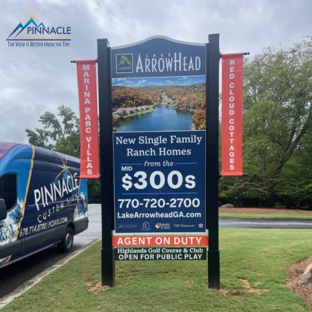
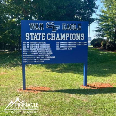
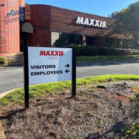
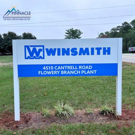
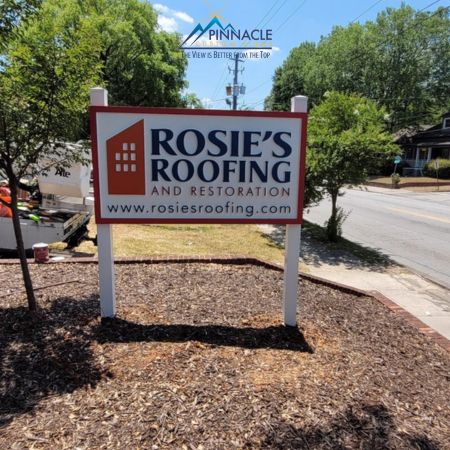
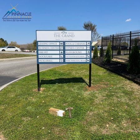
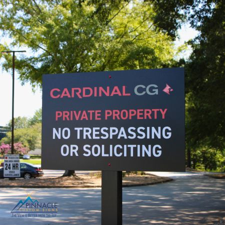
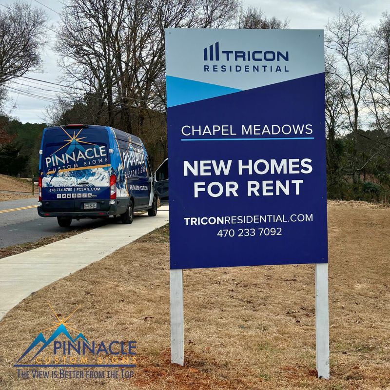
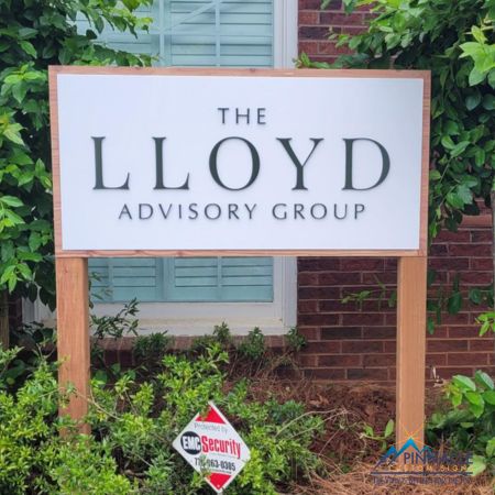
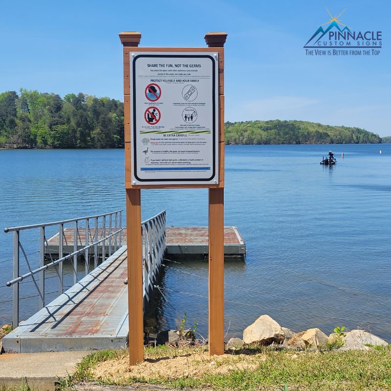
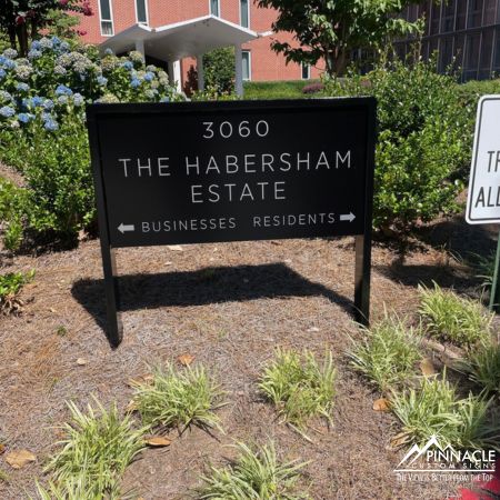
Post signs are one of the most popular types of outdoor signs, post and panel signs use a simple approach to make a big impression. Using a straightforward, durable design, these signs display a large panel sign supported by two posts, one on each side. The result is a large, prominent display for all passersby to see and enjoy.
Depending on the material you chose for the central panel, you have the option of getting a long-lasting full-colored sign that will certainly grab the attention of people as they pass your location. However, three-dimensional lettering can also be used if more character and elegance is desired in the appearance.
The posts are often constructed of wood, aluminum or even vinyl and can have an assortment of caps to complete the look you are trying to achieve.
Normally, Post signs & Panel signs are not internally lighted, but can be illuminated using indirect lighting from the ground or other sources of light, if you would like to also have the sign stand out during the evening.
Call us today for a FREE consultation to make a really impressive new post and panel sign for your property’s location.
Home of Hope Gwinnett Children’s Shelter
The Gwinnett Children’s Shelter in Buford, GA provides resources to help homeless single mothers and their children, as well as youth who “age-out” of the foster care system, achieve the necessary life skills training they need to successfully thrive outside the program, for the rest of their lives.
Recently the executive director, Maureen Kornowa reached out to Pinnacle to discuss a re-branding project for the shelter. Their current branding had the tagline “Where Hope Lives”, encouraging those who took shelter at the campus that there was hope for a brighter tomorrow.
Maureen decided to take it one step further by branding the shelter as a Home of Hope. Pinnacle met with Maureen to discuss the overall concept of re-branding the signage to make it warm and inspirational, but keep the some of the old brand color during the transition.
The Gwinnett Children’s Shelter, now known as Home of Hope, needed a complete overhaul of exterior, interior, and vehicle branding. The new branding needed to convey the message that they wanted to portray to both the public and the residents.
In the first part of this recap, we are going to focus on the exterior signage that included directional and way-finding signage, a new monument sign, and street banners.
Entryway Signage
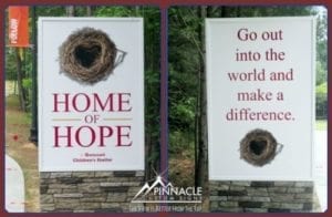
The entryway for Gwinnett Children’s Shelter was previously marked with a post and panel sign that identified the shelter. In its current state, it was not easily noticed, and someone looking for the shelter could easily pass it by.
Our meeting with Maureen identified the need to replace the existing system with an illuminated sign so that it would not be as easily missed. We replaced the existing signage with a new lighted monument sign that was made from a Peachtree Foamcraft stacked stone base with a lighted cabinet for greater readability.
To convey the new inspirational overhaul, we also incorporated motivational message on the exit side of the sign that says: “Go out into the world and make a difference.”
Directional Signage
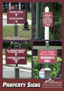
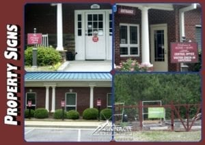
The Shelter provides a safe place for children and their mothers and they wanted to ensure that their signage provided direction for residents and visitors alike. It was also important that they protected the living area for residents and gave them privacy from the public.
We replaced existing way-finding signage, as well as added new signs, to ensure that visiting traffic would be able to identify and correctly move in the intended direction around the facility.
The newly installed bronze post and panel system that was being used for directional signs required our team to do several walk-throughs to ensure that anyone visiting the facility would be instructed to go in the right direction and see if there were any additional signage needs not being met.
Street Banners
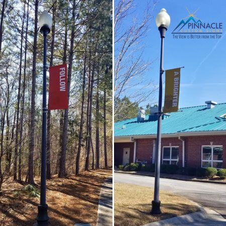
The Home of Hope also requested new pole banners to welcome visitors and residents while conveying a message of hope.
For this reason, our graphic production could not be the standard double-sided banners using the same art on the front and the back of the same banner. We had to do a drive through to make sure we provided consistent motivation to everyone at Home of Hope.
The challenge with installing these new banners was that they had double-sided graphics and we had to make sure that the message read the same both coming onto the property as it did leaving the property.
As we mentioned above, this project encompassed a complete sign package that included not only the exterior signs discussed in this article. It also included interior signage as well as a vehicle wrap. We will discuss the details of these projects in future articles.
Batory Foods
In December, we were contacted by Batory Foods, a leading national distributor of high-quality food ingredients for a broad range of food manufacturers and suppliers throughout the United States founded in 1979. Headquartered in Chicago, they have a large network of distribution centers across the country and were looking to expand their market in the southeast by opening a branch in the Atlanta area.
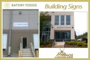
Since this was a new distribution center, the need for new signage was very high as the building and the grounds needed to be identified appropriately. The new center was to be almost 230,000 square feet and had two separate sides for shipping and receiving.
When they first called on us, they were in the process of closing the lease agreement and wanted the signage project to begin as soon as the building was ready. So, while they were working on finalizing the lease, Stephen began working with Jessica Stoja, Operations Project Manager, and Rick Halcik, the site manager, to determine the various types of signs that were needed.
In the beginning, they were not sure whether they wanted lighted signs or unlighted signs for some of the larger signs. Because of this, there were several iterations of design before the plans were finalized and approved. Once that happened and the lease was signed, we got to work manufacturing each of the signs.
The complete package including the following signs:
- Delivery Check-in – Here, we created a 3’ by 10’ metal sign with a vinyl graphic to be placed above the delivery area as well as a sticker placed on the entry door to identify where deliveries to the plant were to go
- Fence Signs – There were two fence signs that directed visitors and drivers to the appropriate entrances made of poly-metal (also known as di-bond) with vinyl graphics
- Marquee Sign – Added white vinyl to an existing monument sign indicating the plant in the industrial park
- Dimensional Building Sign – We used painted and routed HDU (High Density Urethane) to create a vivid building sign and etched vinyl logos at the visitor’s entrance to the building,
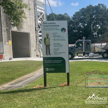
- Directional Sign – This sign, used to direct visitors and drivers to the right building entrance, was created using a vinyl post and panel system from 4Ever Products mounted into a foam base which had the appearance of stucco from Peachtree City Foamcraft.
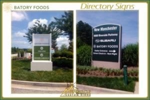
Any new business, whether it is a brand-new business starting out, or a well-established business moving into a new location, will most likely need multiple types of signs: building signs, interior signs, outdoor signs, etc.
A full-service sign company can help with developing signage that looks professional, is informative and is consistent with your corporate branding.
Prince of Peace Church
Earlier this year, we were given the opportunity to upgrade the look and feel of the directional signs at Prince of Peace Church in Flowery Branch, Georgia. The signs were originally installed in 2005 when the facility first opened. Many of the existing signs were in dis-repair, some of which was due to damage caused by woodpeckers. Additionally, the original signs were fairly small, and more than one parishioner was heard to say “what signs” when asked.
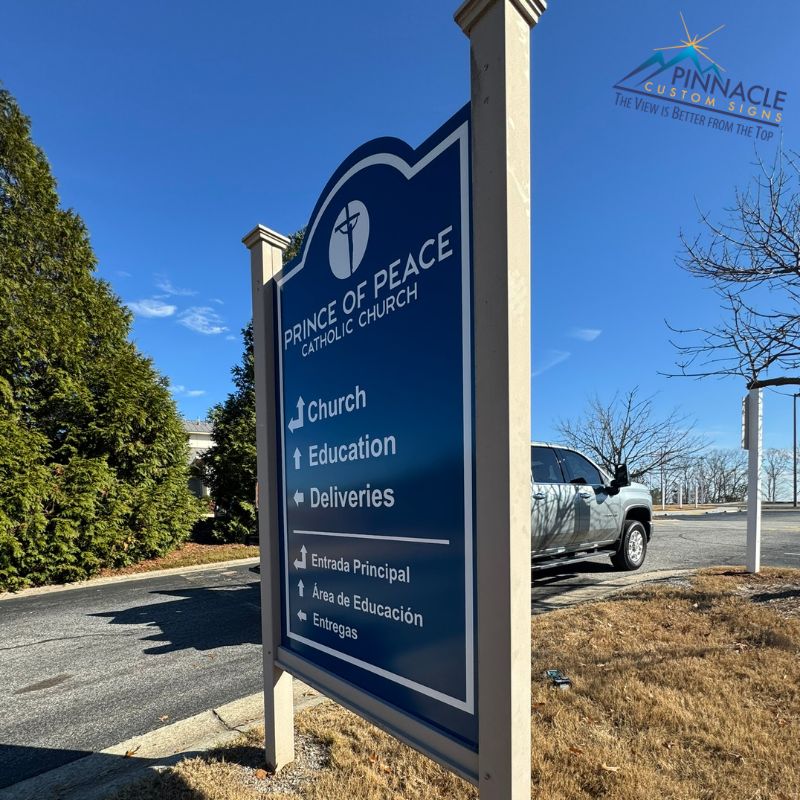
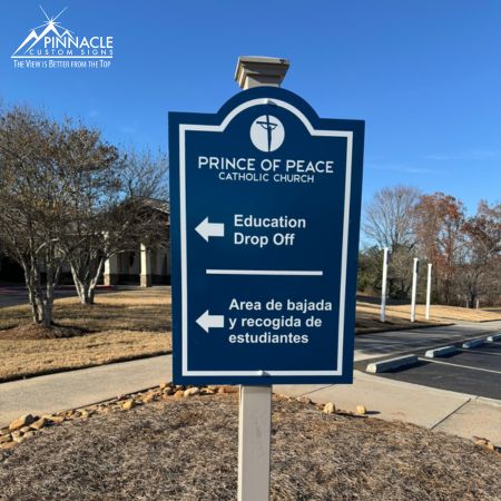
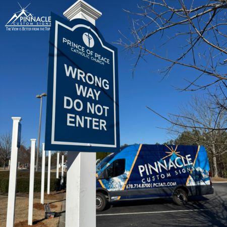
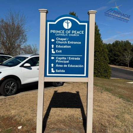
We opted to use a combination of single-rail post & panel signs for the larger signs and for the smaller signs, we used a single post sign. The signs we designed, while they had a similar look to the existing signs, now have a cleaner look, include the church’s logo and have increased in size an average of 35%, making them more visible. The materials chosen were a combination of metal and molded vinyl, which would better withstand the weather and require less maintenance.
Overall, the project was a cost effective way for the church to upgrade what they had, increase visibility for the more than 12,000 church members, and direct people to the right spots.
As an added bonus, we upgraded the way the church displayed banners they used to make people aware of special events. In the past, they had attached the banners to a piece of plywood and laid them on the ground. The church now has stands specifically designed to display banners, which has a consistent look with the other signs on the property.
