Contact Info
Office Lobby Signs
Make a great First Impression when customers walk into your office!
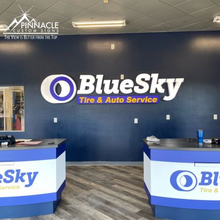
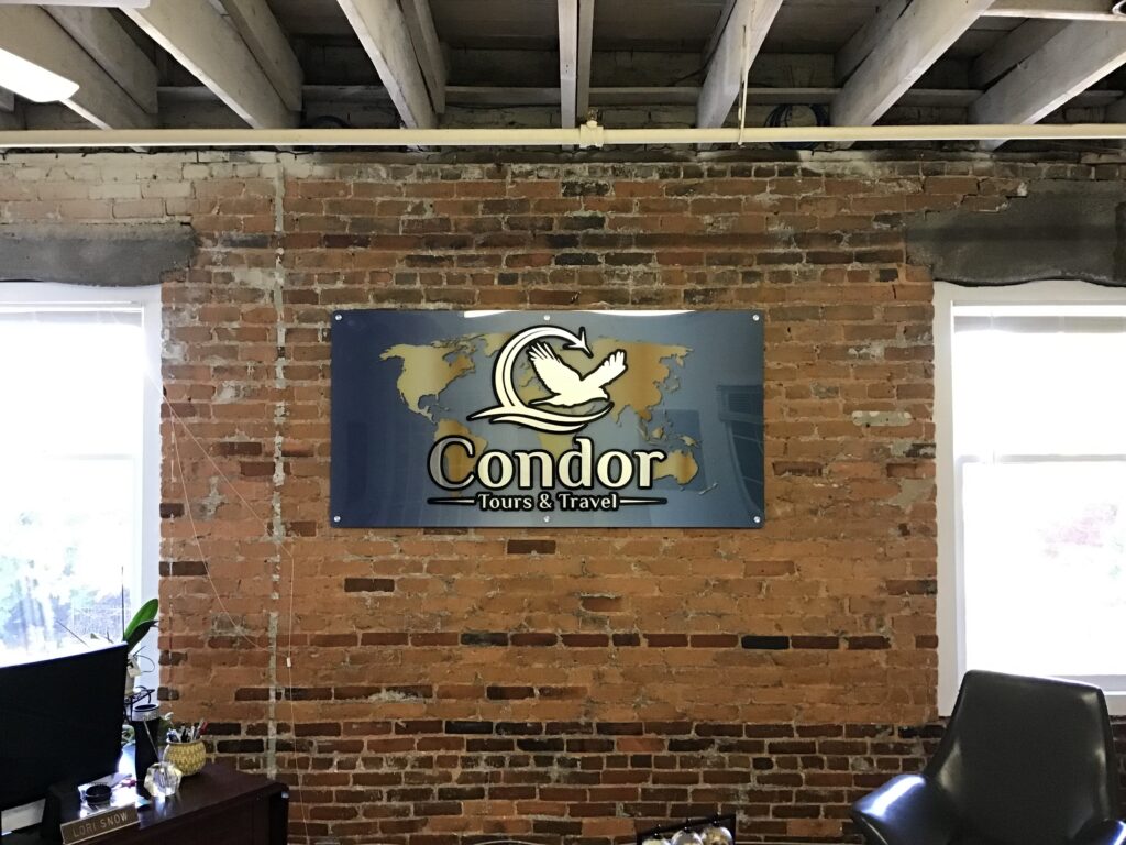
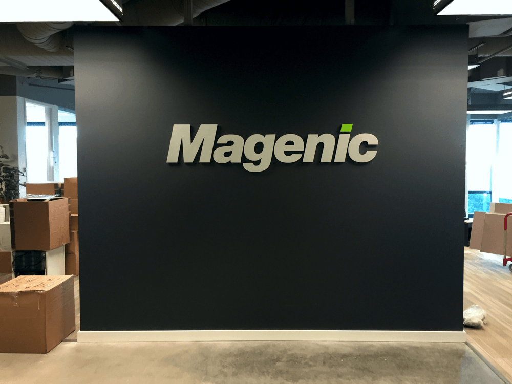
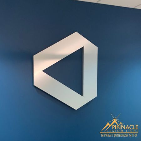
The lobby of any building is a high traffic area and a perfect place to proudly display the name and logo of your company and give visitors a lasting first impression of your business.
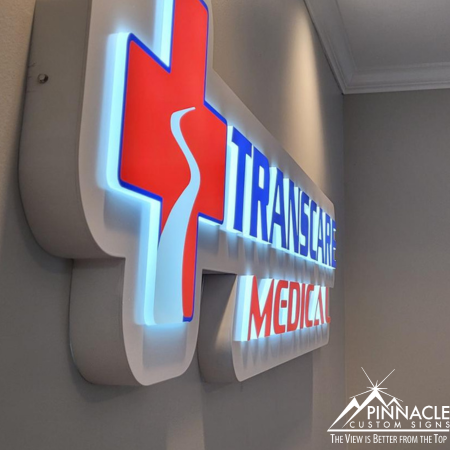
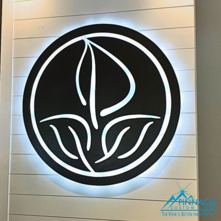
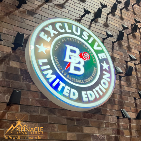
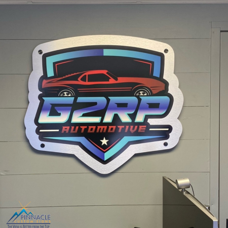
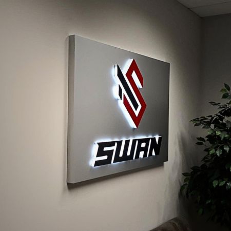
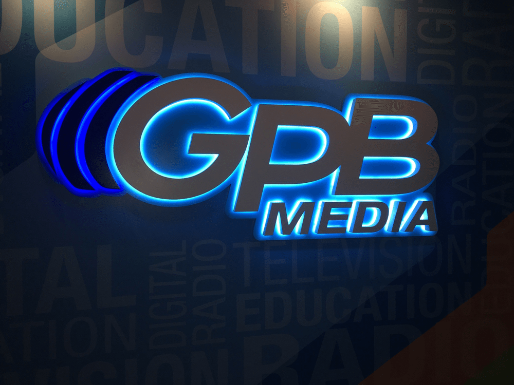
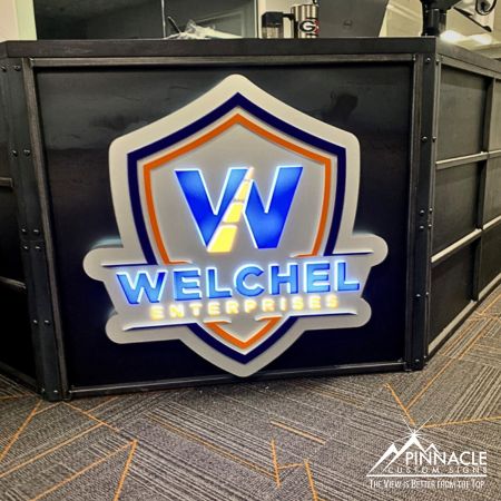
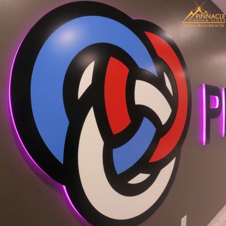
Be creative when designing your lobby logo and let your imagination run. Your lobby sign can be crafted from a wide range and combination of materials and finished with unique and complementary textures. It can even be back-lit or front-lit, or even made of LEDs.
Once you get past the lobby or receptionist’s desk, office signs are needed to direct visitors around the facility.
Office buildings, schools, and hospitals are just a few of the institutions that rely on suite signage every day.
If your office space is in need of new suite signage, door signs, office logos signs, or another type of sign, we provide a plethora of options to accommodate any budget. Give us a call to get a free quote for your custom office signage today!
Office Signs For Businesses
Every business office needs some form of signage. The issue many businesses face is knowing what signage is necessary and how to leverage that signage to the greatest benefit.
Office signs includes everything from lobby signs to ADA signs to wall graphics. When deciding on what types your business needs, consider how the different types of signs fulfill the roles of:
- Engaging – Catching the eye of viewers and piquing their interest.
- Informing – Conveying a message to the viewer in a concise manner.
- Promoting – Building your brand and marketing your market offerings
- Compliance –Providing a safe, equal-access location.
- Safety – Alerting viewers to dangers
- Wayfinding – Directing viewers where to find what they are looking for.
Office buildings, schools, and hospitals are just a few of the institutions that rely on suite signage every day.
If your organization is in need of new signage, we provide a plethora of options to accommodate any budget.
From high-end materials such as stones and metals, to more budget-friendly options like synthetic materials and laminates, we can custom create signage that you’ll be proud to display.
Contact us today to learn more about how we can help you and to get a free quote.
Types of Lobby Signs
Your reception area or lobby makes a profound impact on your client’s perception of your business. A well-designed lobby conveys your company’s branding and culture while welcoming your ideal client.
Reception Signs
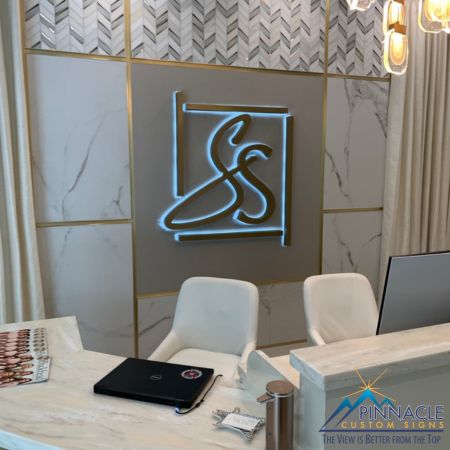
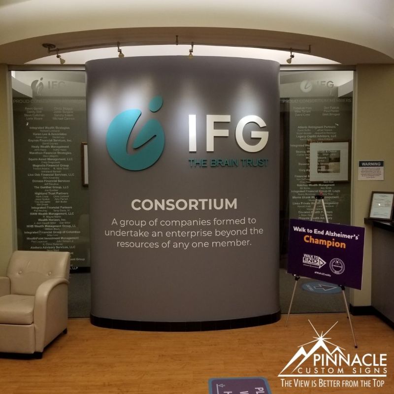
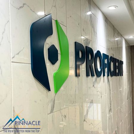
The key piece of signage for your lobby is your logo sign. This sign usually incorporates your logo and business name and is displayed in a prominent area of your lobby. It serves to identify the area as being the correct location and sets the tone for the office.
Be creative when designing your lobby logo and let your imagination run. Your lobby sign can be crafted from a wide range and combination of materials and finished with unique and complementary textures. It can even be back-lit or front-lit, or even made of LEDs.
For example, law office signs will often be a more clean, traditional design that conveys professionalism, neatness, and strength. It may be a brushed metal office sign with stand-offs and back-lighting to make it really stand out from the wall.
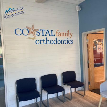
Or, in another example, dental office signs would be more casual and creative, particularly if they are a family dentist. Their wall sign might use acrylic and vinyl with over-head lighting. This method allows for more details without being too expensive.
Lobby Area Signs
Your lobby area may have several other signage opportunities.
If your lobby has windows, you can use them to your advantage. You can use vinyl graphics to promote your business services or inform potential customers about your business. For instance, a dental office could use vinyl decals to add images of happy, smiling families on the windows; they could also add information about their services “family dentistry”, “root canals”, “crowns”.
Window graphics also allow you to control the amount of light that comes in and the visibility through the windows. This gives you the option of making your space more private. We often install frosted vinyl on glass doors and windows to provide privacy while still allowing some light through.
Another opportunity to use signage is on your walls. You can easily add your company’s mission/vision statement, quotes, or even artistic designs to the walls of your lobby. Vinyl wall graphics is an easy way to add texture and create an accent wall in your office.
Directional Signage
Every office needs directional signage – signs that point to where the restrooms are, where the emergency exits are, and where to find other key locations in the office. These types of signs are collectively called wayfinding signs.
Wayfinding signs must often meet the ADA guidelines. This governs the placement, size, colors, fonts, and textures used in key directional and informational signs. While these guidelines do limit what you are able to do, you are still able to customize certain aspects of your wayfinding system.
Custom Business Sign Options For Your Office
Custom office signs help keep your office organized and can help with décor. Here are some of the common types of signs that many offices and businesses use.
ADA Signs
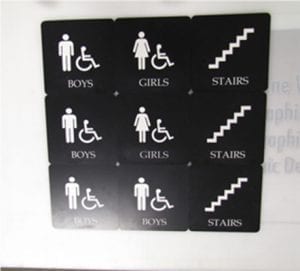
Certain signs must follow the guidelines set by the Americans With Disabilities Act. This law designates guidelines for the placement and design of key signage that all buildings are required to have. This means that, when designing office signs, you must take into account certain design elements. These elements are already part of good sign design so they should not be difficult to achieve
A sign needs to be placed on the wall in areas that are easily viewable and at a standard height. This helps individuals who are sight impaired find the sign. The sign must include raised lettering and braille that are properly spaced apart.
The lettering and pictograms must be easily recognizable, which means using san-serif fonts that are easy to read (ie. using Arial instead of Comic Sans or Times New Roman). You also need those words/pictograms to stand out using contrasting colors; the most basic contrasting colors are black and white.
The guidelines also require that any room that doesn’t change its designation, ie. the bathroom, supply room, break room, must have a room sign that follows the guidelines. If your office rooms can change designation, like if you have meeting rooms or offices that frequently see change, then you should use room numbers on the room sign which meet the guidelines.
Custom Door Signs
“I wonder where this door leads?” should never be a question asked in your office. Door signs, also called room signs, help visitor and employees identify the areas of your office easily.
As mentioned above, all permanent rooms require compliant signs, ie. kitchens, and restrooms. Semi-permanent rooms, like classrooms, usually use an alphanumeric system for designation and do require compliant signage as well.
This simply means that you need to incorporate raised lettering, braille, and good design sense into your signs. Most company branding guidelines can easily be applied to compliant signs without breaking from the branding.
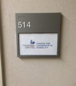
Room signs typically secured to the wall on the latch side of the door; this means that if the door opens from the right, the sign will be on the right. The height of the sign is determined by the ADA guidelines.
You have a variety of options when it comes to these signs. You can go the simplistic, budget-friendly way of acrylic and vinyl to create a no-frills sign that will mount flush to the wall. Or you can make an impression by using brushed aluminum and using stand-offs to mount it. There are a variety of options available for every budget.
Changeable Room Signs
For those rooms that change designation fairly frequently, you can have changeable room signs. The most popular type is a lens window frame; it allows you to slip a piece of paper behind the clear lens of the sign to update the room designation.
A room slider sign allows you easily slide the sign to uncover/cover and additional message. These are often used for conference rooms signs because it allows you to designate whether a meeting is in progress or not.
For private offices, you can have a sign that allows you to change out an employee’s name. These are typically brushed metal signs with individuals like employee nameplates.
Custom office door signs are not expensive and can be customized to match your business’s branding. Contact us today to talk about what your needs are and how we can help you.
Custom Wall Graphics
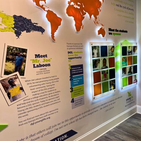
Office environments are not known for being beautiful places; the goal is on encouraging efficiency and focus. However, any business can take advantage of wall graphics to bring alive their walls. How?
You can use wall graphics to add your company’s mission statement, vision statement or a motivational quote to any wall. This provides a daily reminder for everyone of the core principles of your company.
You can use wall graphics to add scenery to an otherwise drape interior. While white walls may not distract your employees, it can be demoralizing when there is no décor to warm the area. Adding the city landscape to a wall or other design will provide an accent wall and a focus to break up the homogenous look of the office.
You can use wall graphics to provide direction, labeling areas of your office for the different organizational operations found nearby. You can also get creative, using wall graphics to make a tracking board; we have one in our office that tracks this month’s leads to sales to completed orders and compares it to our goals for the month. It helps keep everyone on the same page and on track for meeting those goals.
Custom Wall Signs
Your lobby isn’t the only place that you can put a wall sign. Conference room signs can help add extra formality and branding to your meeting rooms. This is especially true if you will be having client meetings or video meetings.
Other types of office wall signage includes adding signs commemorating accomplishments like featured articles, awards, etc. You can use vinyl wall decals to add the company mission/vision statement to an area.
Directional Signs
Getting individuals where they need to go and helping them avoid mistakes are important. These types of signs need to be clearly seen and understood. They often follow parts of the ADA guidelines but they don’t always need to.
If you have a large business campus, then you need to have a clear map of the location before planning your sign placements. You need to consider where to strategically place signs so that individuals can easily follow them and see them. For instance, you don’t want your lobby sign facing away from your front entrance door or windows; individuals need to clearly see the sign when they are approaching.
And you want to make sure that the signs are clear and concise. You don’t want your visitors wandering around, getting frustrated because they can’t find the right office.
Common Questions About Office Signs
When talking with potential customers, we get asked some common questions, like these questions. If you have specific questions about signs for your organization, please give us a call. We’d be happy to discuss your needs and give you advice.
What signage is important for an office space?
The most important piece of signage in your office is your lobby sign. This single sign makes the most impact when it comes to branding because it sets the tone for all of the other signage in the office.
What signage is required for office spaces?
Every public space is required to have signage that meets the ADA guidelines. This generally means that you will need restroom signs, door signs, and safety signs, like emergency exit maps.
How can you design signage to match your branding?
The easiest way to design signage is to talk with a sign company that has an in-house graphic designer. They will usually sit down with you to go over your branding guidelines and your budget and recommend various options. Even if you can’t afford your dream office, we can work with you to plan out what signage to start with and what you can add later.
Wayfinding
Wayfinding is the common term used in the sign industry to refer to signage placed in strategic location to guide people in the right direction of locations where they aren’t familiar with the layout. We see these everyday on the roads we travel. Signs tell us how far to the next city, which way to turn to head in the direction of the next road we will take, or pointing toward destination locations such as lakes and parks.
What is wayfinding?
In the business world, wayfinding signage is often one of the most important but overlooked areas of signage needs. Every business owner knows they need outdoor signage to let clients and customers know where they are located, but what happens once that client arrives on your property. For instance, think about what would happen at a hospital that didn’t have any signage noting the direction of the emergency room. For some patients that could be the difference between life and death. Not all wayfinding needs are that critical, but they definitely can help alleviate difficulties during the normal workflow of the day.
Pinnacle Custom Signs Directional Signage guides your visitors to prevent problems in them arriving at the right location.
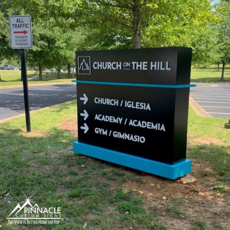
Why would I use wayfinding in my business?
- Identify locations for patrons about things you want them to know while on your property. The most common identification signs include bathroom signage, exit signs, and office numbers or names.
- Provide direction. Our clients at Georgia State University had a large need for interior signage that pointed students in the direction of classrooms, labs, and bathrooms before they ever arrived at the actual location sign.
- Be informative. Many times you may need to provide more detail to someone visiting your workspace such as a map of the property with information about all of the locations around the property.
- Warning signs such as no smoking, toxic, do not enter, or keep out signage that lets someone know that they need to heed advice.
Where should I place wayfinding signs?
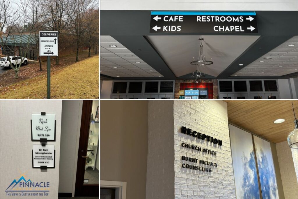
The most effective wayfinding and directional systems are usually based on figuring out the human behavior of someone who is new to your location. If you aren’t sure how people reacting upon first arriving — ask the person who sits at the front desk — they can provide you with some good insights. If that doesn’t work in your situation, apply these simple principles:
- Do not make them think! Create a comprehensive, clear and consistent visual communication system with concise messaging.
- Show only what is needed and relevant is to the space, location and / or navigation path.
- Remove excessive information to create a clear visual environment ahead.
GA State Dimensional Letters & ADA Signage Wayfinding signage takes the guess work out and guides you in the right direction
Our team has the experience and expertise to help you figure out the most effective wayfinding plan for your business or location. Since we often visit a property for the first time for a consultation, it is easy for us to try and figure out what we would need to know in order to navigate a building. We also are experienced in ADA compliance and can ensure that your signage accommodates any necessary ADA guidelines to help your clients and customers know exactly the right information to get to the right location.
Related Projects
The Werner Law Firm
Sherry Rosen of the Werner Law Firm contacted us in 2016 about new signage for their Buckhead law office. They shared the building with another law firm and needed to deferentiate themselves so that visitors could easily find them.
We created two custom logo signs using black dimensional letters on a brushed aluminum backing. The lobby sign included the firms full logo with the “W” made using applied vinyl. The signs were mounted with standoffs to give it an extra dimension and make them more noticeable.
Creating Lobby Signs for the Buford Academy of Music (BAM)
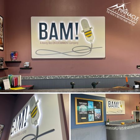
Buford Academy of Music (BAM) has everything you would want as a musician. Whether you are looking to study singing, play an instrument, start a rock band, or write songs BAM can help you reach your full potential.
Honey Bee Entertainment is the parent company that owns BAM. Honey Bee Entertainment is a recording and production label, that gives students opportunities not available at other music schools.
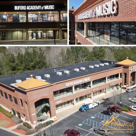
BAM opened its facility off Friendship Road in Buford. We broke this project down into three parts. The first part of the project was window and door vinyl. Window graphics can be very effective in promoting your business and drawing customers into your business. The window vinyl turned out great, but the other two aspects of the project are the real rock stars.
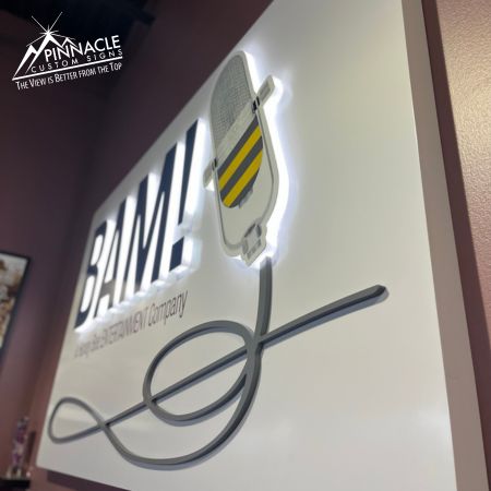
A great lobby sign will leave a lasting impression, and the Buford Academy of Music Lobby Sign is no different! The lobby sign is a 2-inch deep aluminum pan with edge-lit pierced-faced elements. The BAM lettering and microphone logo are acrylic pieces with a vinyl overlay. These features make the sign pop and visible from the parking lot.
The third and final act is the biggest aspect of the project. This set of Channel Letters is 40 inches tall and spans 36 feet on two raceways. Making them highly visible by land or sky. If you don’t believe me check out the video on our YouTube Page!
