Contact Info
Monument Signs & Marquee Signs
Bring Your Customers to Your Front Door!
Make a strong impression with a new monument sign!
Don’t let drivers pass you by on the road without catching their attention. A monument sign can make a strong first impression and draw customers to your front door.
These road-side signs are the first contact that your customers have with your business. A well-designed and executed sign gives the impression of quality and permanence like no other sign can.
Make sure that your sign gets you noticed – even from a distance.
We work with you to design a custom sign for your business. From standard monument signs to marquee, pylon, and post signs, we want to help you stand out! Whether you own the building or lease a space, contact us today to discuss your signage options!
Give us a call at (678) 714-8700! Our team of consultants will work with you to determine the solution that will work best for you and make sure that your customers will be able to find you.
Types of Monument Signs:
When we’re talking about monument signs, we’re talking about the signs on the side of the road that has business names on it. There are many different types of monuments signs depending on its use and how it’s built.
Tenant Signs
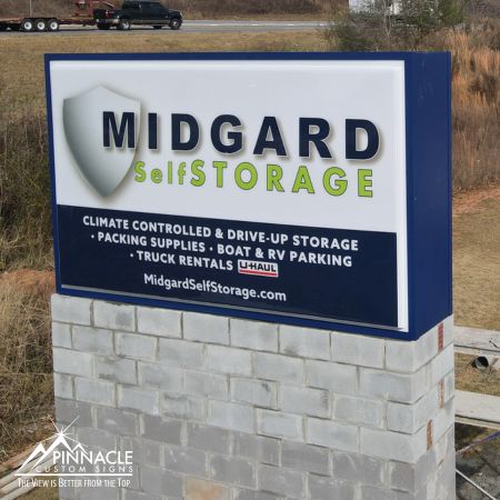
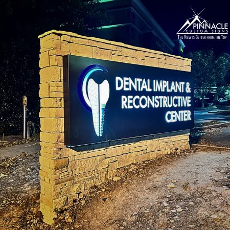
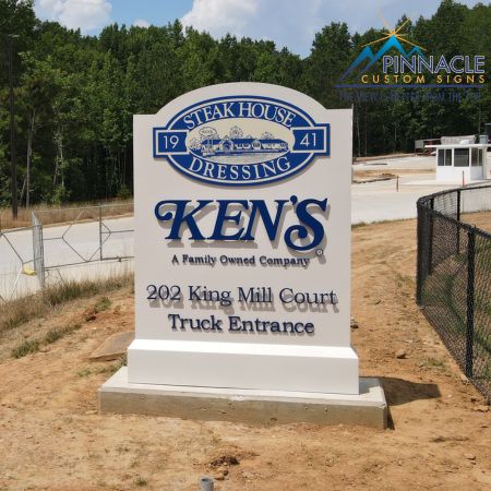
If you are a single tenant in a building, you will typically have a road-side sign dedicated to just your building. While you have a great deal of design control, the sign is still bound by the local rules and regulations. For instance, you may have to use a specific style of sign – like using a brick base of a certain color and keeping within a certain size.
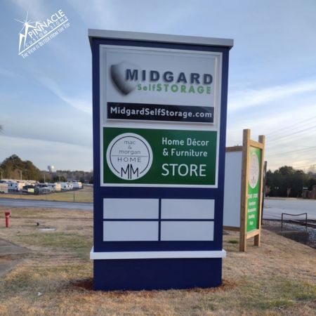
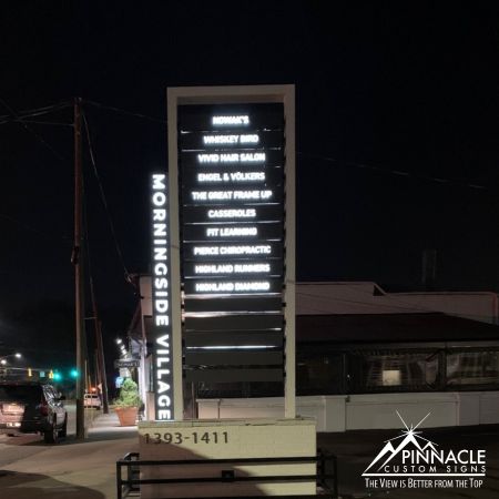
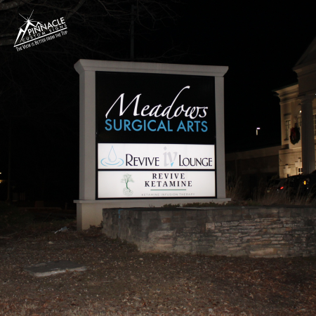
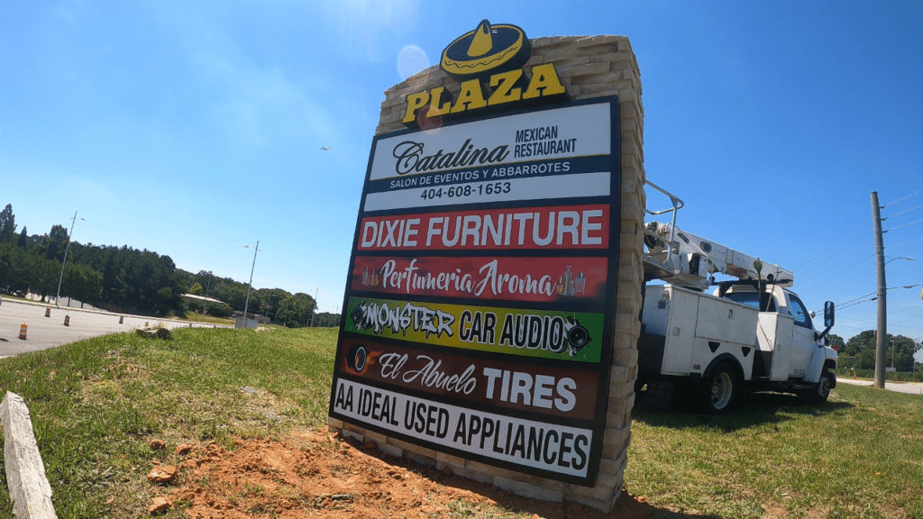
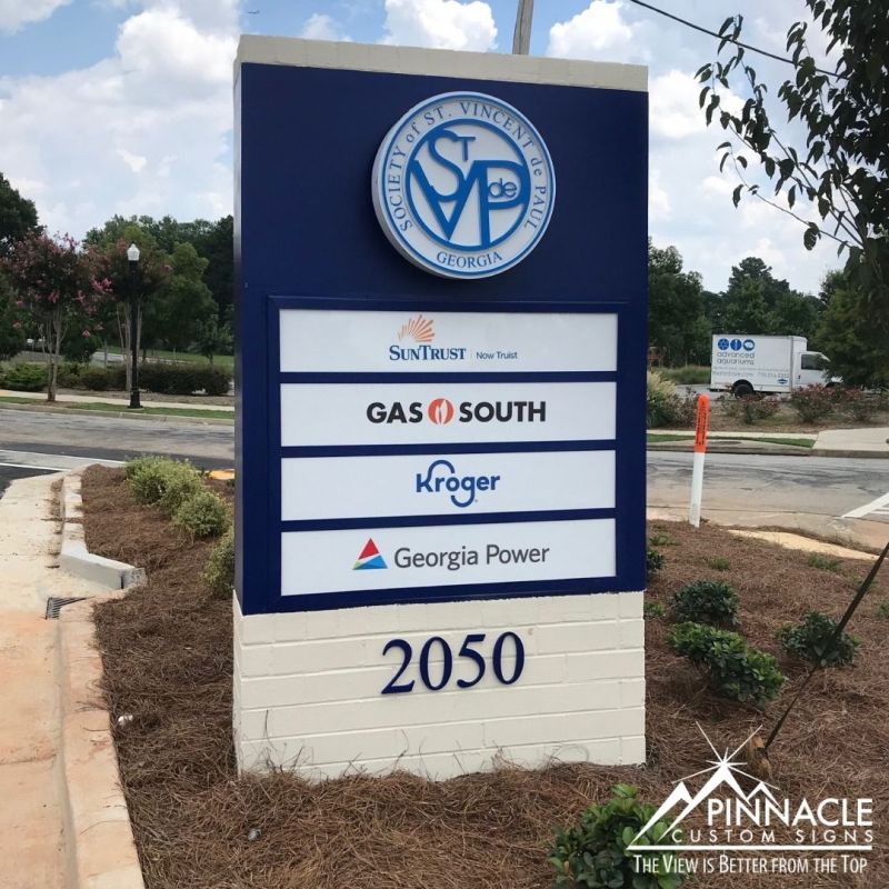
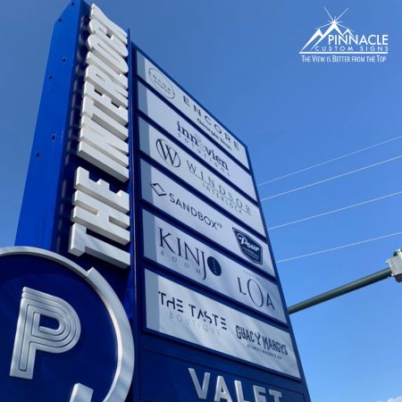
If you are one of multiple tenants in a building, you will typically have space on the building’s existing marquee sign. A marquee sign is a monument sign with space for multiple smaller signs. We typically see this on office buildings and shopping centers.
Lighted versus Unlighted Signs
When choosing between lighted and unlighted signs, it really comes down to personal preference and visibility concerns. Lighted signs do tend to cost more than unlighted signs; residential signs tend to not be lighted, while commercial signs are, because of this.
You can light a sign in a number of different was depending on the kind of sign. Many multiple tenant signs are internally lite sign cabinets – meaning that the light comes through face of the sign. Single tenant signs could be internally lite sign cabinets or they could be lite by other external lights that may or may not be attached to the sign itself.
Why are road-side signs important?
When something is so prevalent in our lives, like signage is, we often forget why it’s there and why it’s important.
Signs perform a basic function – helping people find a location. We’ve all had that frustrating experience when we’re trying to get to a location but have trouble finding it. While it can be caused by bad directions or poor visibility due to night/weather, it can also be caused by poorly designed signage.
It makes sense that you would want to design your signage to help your ideal customers find you more easily. The easier they can find you, the more likely they are to visit.
There is another related reason that is often overlooked – emergency services. It’s annoying with a customer has difficulty finding your location; it can be deadly if emergency services – fire, medical, police – have difficulty finding your location.
So, whether it’s because you need to draw in more visitors or want to improve your safety, road-side signs are incredibly important.
Residential Signs
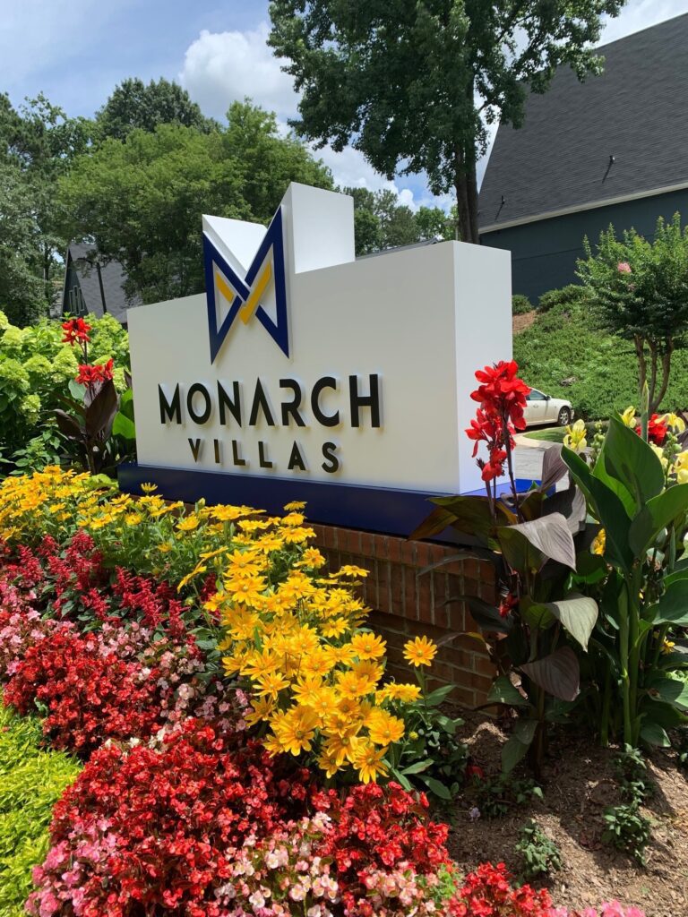
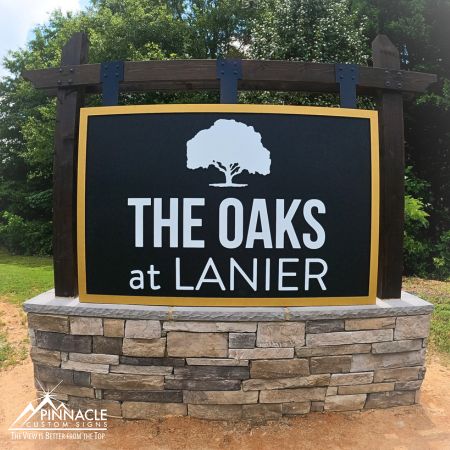
Another common type of monument sign is community entrance signs. This includes subdivision signs, apartment complex signs, and signage within a neighborhood directing you to key locations, like the pool, community center, etc.
Entrance signs for communities can be as simple as post and panel signs or be as complex as combining signage with landscaping to create a truly unique look.
Subdivision monument signs will most often mirror elements of the building architecture in the neighborhood. For instance, the subdivision entrance sign might use the same brick/stone facade as many of the houses or key locations. The style of the sign face will also reflect the neighborhood culture; for instance, an upper class neighborhood would use scripted fonts, rich looking materials, etc. while an apartment complex might have a more modern energetic feel.
Neighborhood entrance signs are important for building a sense of community and for directional purposes. It can also set to the tone for the neighborhood; the style reflects the people and expected lifestyle and the sign maintenance reflects how well looked after the community is as a whole.
How do monument signs help drive business?
In addition to helping your ideal visitor find your location, monument signs help you build brand recognition in your area. The more someone drives past your location, the more likely they are to remember you if they see your sign. That is why branding is so important!
You want your sign to convey who you are and what you are. One example is Workout Anytime; their logo is a 24/7 in a circle. They want to make sure that their logo and their name is out there as many times as possible. When people see their signage, they immediately know that it’s a 24/7 gym. Instant recognition.
When looking at your own branding and signage, consider what kind of impression it’s going to make on your ideal customer. Will they understand it? How will they react to it? Is it clear? You only have seconds to make an impact when someone is driving on the road. Keep it simple and clean.
What kinds of materials can be used for monument signs?
Monument signs can be built from a wide variety of materials to achieve different looks for different budgets. When looking at one of these signs, you need to consider the foundation, the sign face, and any extra features, like lighting.
Foundational materials
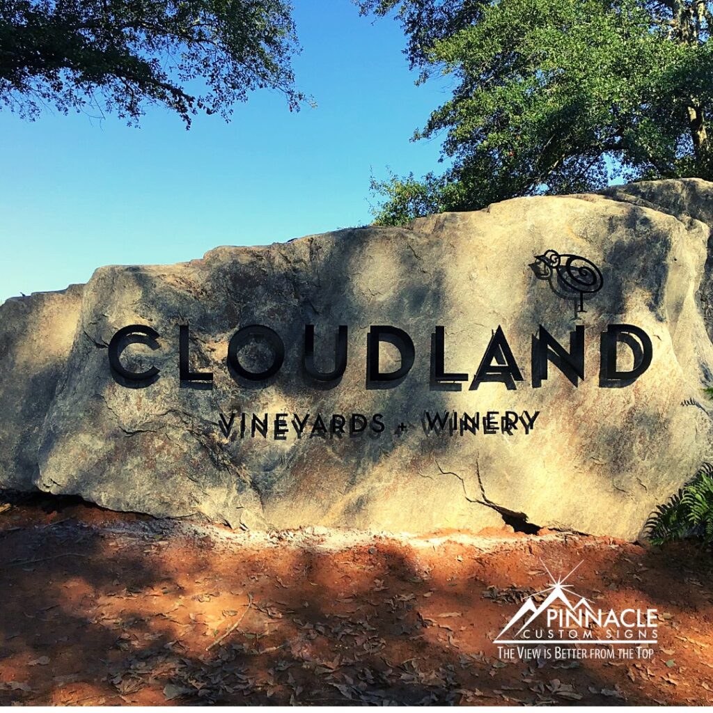
The most common look for a foundation is brick, stone, stacked stone and concrete. What many people don’t know is that many of the brick or stone signs out there don’t actually use real brick or stone.
While you can use the real stuff, foam is an excellent alternative. The kind of foam used differs depending on the sign, but we can make it look like any other material. Many people chose foam because of its look and cost-efficiency.
Another consideration to make is the breakaway foundations. If your sign is going to be place in a location where there may be a risk of a car accident impacting it, you may want to consider the breakaway foundation. Essentially, it makes it so that the sign will break away from its foundation if hit hard enough. This increase the safety for drivers.
Sign Face Materials
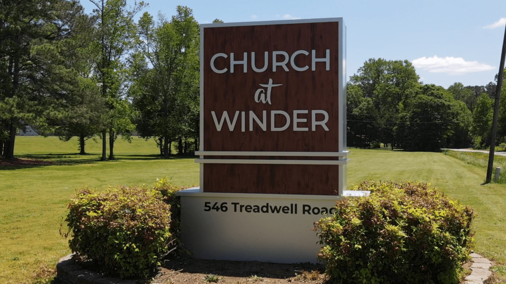
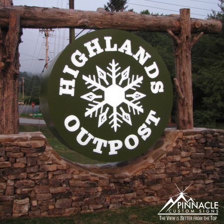
If your sign is a single tenant sign, you have many different options when it comes to the sign face (barring local sign rules and regulations). Many businesses choose to go with HDU (high-density urethane) which is a type of very tough foam. It can be routed and painted to look like different types of materials, including wood. This is a very cost-effective option.
You can also use aluminum for a more polished look or really any type of material that you want.
Marquee signs tend to use a sign cabinet with spaces for each building tenant. The sign face for each business is limited in size and uses push through graphics on an opaque sign substrate.
Lighting
Sign lighting is one areas where you have many options. Marquee signs are frequently internally lite sign cabinets with some external lighting for other parts of the sign.
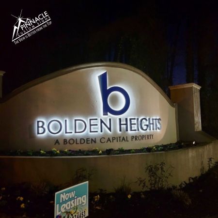
Single tenant signs can use a variety of lighting techniques for lighting the sign. Halo or back-lit signs are illuminated by light that is behind the actual sign, creating a halo effect. This frequently used with channel letter or other types of lighting to create an eye-catching sign.
Edge lite or cove lite signs are illuminated by a light source on the edge of or in a recess or the sign. Some signs are self-illuminating, like neon signs and channel letters.
Spotlighting is another commonly used type of lighting. The light source is usually in the landscaping around the sign and shines up to illuminate the front of the sign.
Sign Restrictions
You need to be aware of the sign restrictions when designing your sign.
Your city/county/state has guidelines that you must follow to protect the public interest and because of aesthetics. This includes restrictions on where you can place your sign (ie. 15 feet from the right of way), the size of your sign, the foundational material, etc.
Builders often have sign restrictions as well. They want the signs to match the look and feel of the buildings they are designing. And finally, you have structural issues that affect your sign. For instance, how much wind load can it take?
The good news is that you don’t have to know all of the restrictions. We work with you to find out what the restrictions are and design a sign that meets those restrictions while also meeting your branding guidelines.
Checkout Some Of Our Monument Signage Projects
Big Green Egg
In May of last year we were contacted by Jeff West of the Big Green Egg. For those not familiar with the Big Green Egg, it is an outdoor kamado cooker that has the flexibility to do everything from baking to smoking to grilling. This is why many consider it to be “The Ultimate Cooking Experience”. The “Egg” has many loyal followers, one of which is Mat, on our team, and has become a sort of culture among these fans.
The company started in Atlanta and were currently located in Tucker. They found a new location with very high visibility at the corner of one of the busiest stretches of road in Atlanta: the intersection of Interstates 85 and 285. They wanted a sign in the front of their new location to make a statement and make sure everyone knew that it was the “home of The Egg”.
Monument Sign that Makes a Statement
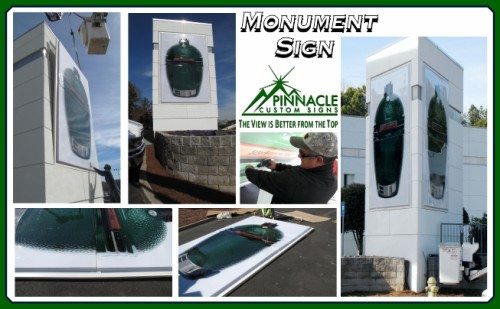
We worked with the team for several months looking at several options for their new monument sign. Some of the earlier designs included making a three-dimensional monument sign in the shape of a Big Green Egg made of high density urethane and another was a flat pan-faced sign. We also went back and forth as to whether or not the sign would be lighted.
When the final decision was made, they decided to go with two embossed and molded pan faces shaped like the famous cooker to fit on an unlit monument sign. The embossed faces would still give them the three-dimensional effect at a lower cost than the fully molded sign and keep it within their budget for the sign. Since the size of the faces were 10′ by 15′, they were too large to make on one piece, so we had to strategically place the seam to allow for support but not take away from the design.
The Rest of the Project
While the pan faces were being manufactured, they also had us work on a few other projects to facilitate their move to the new location. These jobs included:
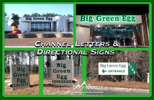
- Moving their existing back-lit channel letters to the new facility and changing the lighting within them to green LEDs,
- Create directional signage for their parking lot, and
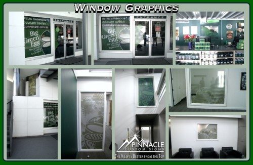
- Create and install various signs for the interior of the new building which included window vinyl, perforated vinyl and poly-metal (dibond) signs.
The last thing they wanted us to do was to move their existing 18 foot tall monument sign to be used as a directional sign guiding customers to their new culinary center. However, there was a catch: they only wanted to move the top 8 feet of it! We had to cut it down, create a new foundation, and finally set the monument, and adding the arrows needed to show the way.
When they finally got everything done and were ready for the Grand Opening of the new facility, the Pinnacle Team was invited. We enjoyed walking through the building and seeing the overall effect of the entire project as well as the yummy food prepared on, you guessed it, Big Green Eggs. The final surprise (for us, anyway) was a paperweight which featured the front of their new building, with the large monument sign and the back-lit channel letters prominently featured and was given away to all the attended their grand opening.
Hensley Automotive
As many in the sign industry would say, “A business with no sign is a sign of no business.” Business signs are vital to attracting customers to your place of business and can be considered your 24×7 sales team. Exterior signs, such as building signs and monument signs mounted near a road attract the attention of passing motorists.
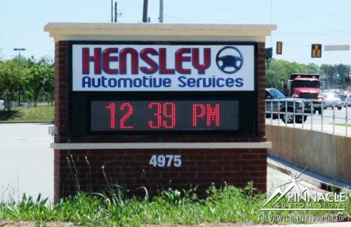
Ken Hensley, of Hensley Automotive Services in Buford, GA, recently approached us to help him with a new and improved monument sign. Hensley Automotive Services is on Friendship Road (now known as Lanier Islands Parkway), which has been undergoing a widening project over the past three years. With the construction project, the old sign was in the right of way and had to be taken down.
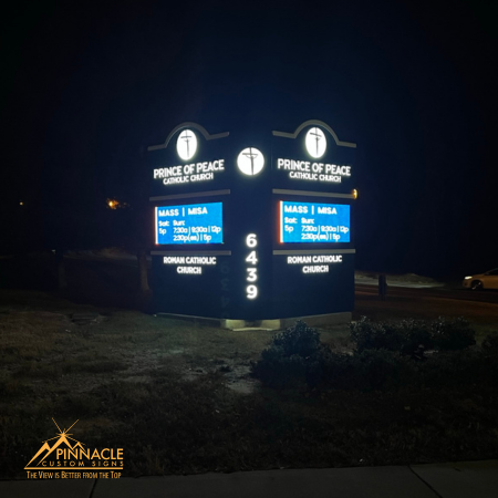
Ken saw this as an opportunity to upgrade his sign to include a changeable LED board so that he could show specials, time, temperature, etc. to draw customers to his establishment.
One thing that limited us in the design of the new sign, however, was the sign ordinances for the City of Buford. According to the city’s code, the sign could only be of a certain height, had to have brick or stone all the way around the sign face, and had to have a total of 64 square feet for both sign faces combined.
With those restrictions in mind we created several versions of the sign for Ken to review for approval. The final design uses a single lighted cabinet, where the top half of each side houses an acrylic sign face which features the Hensley logo, and the bottom half is the changeable LED message board. Once Ken agreed to the design, the fun started.
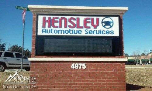
The first step was getting the permit approved from the city. We filled out the appropriate forms, provided required documentation then finally received approval. The next step was to dig the footing for the sign. When this was done, an inspection had to be completed by the city code enforcement team.
The following two steps happened simultaneously: we fabricated the sign cabinet, installed the LED in it, and built the brick structure for the sign. Once everything was ready, the sign itself was set, the stone was finished and a stucco topper was put on.
Most monument sign projects such as this, have many moving parts and involves many players to bring the it to fruition. Like this project, these require knowledge of the various code restrictions, a solid design, inspections, fabricators, and skilled installers. As the sign company working with the customer, we also take on the role of project manager to make sure all the pieces of the puzzle fit into place and the client is happy with the final results.
Apex Apartment Complex – Updating Community Entrance Signs
Earlier this year, Venterra Realty, an apartment complex management and ownership company, purchased a property in Atlanta known as Apex West Midtown that was in need of upgrading their signage. Venterra aims to deliver the most important qualities of a home: community, comfort and happiness.
They meet these needs through exceptional service, convenient locations, attractive amenities, competitive pricing, and community events. They aim to listen and understand the needs of each customer so that their residents experience “A Better Way of Living”.
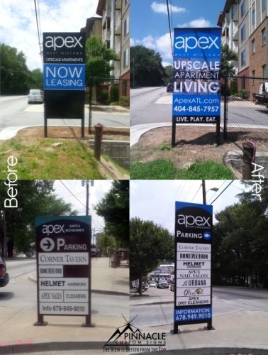
The new complex had been around for a few years and Venterra wanted to update the signage in order to re-brand the community and give it a more modern feel. Teri Davis, the Regional Manager for Venterra, contacted us for pricing and ideas on signage. Time was of the essence in that they had been working with someone else but had not been satisfied with what they were seeing.
When dealing with large projects such as this, it is critical that a good site survey is done as there are typically several types of signs with many variations. Don initially walked the property with Teri to get a good idea of the scope of the project and how best to complete the task. The upgrade called for several types of signs.
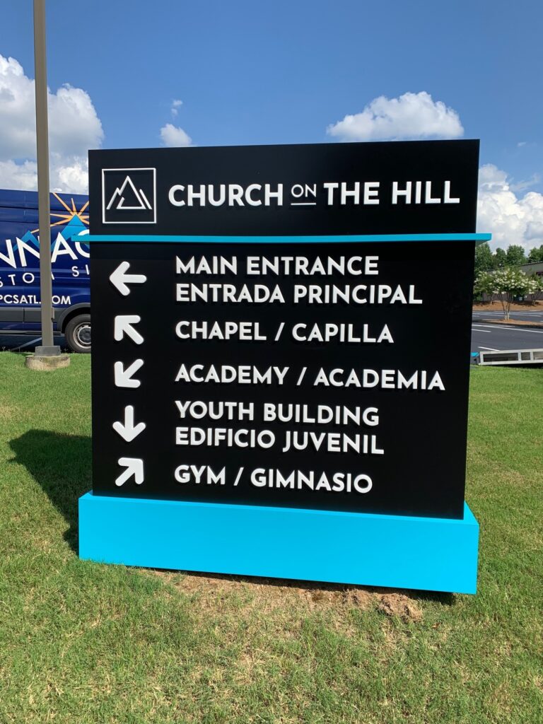
- Directional signage for the garages and hallways. There were no signs directing visitors to the various places on the properties, such as the leasing office, resident parking, retail space as well as other amenities.
- ADA signage for the elevators. Handicapped accessible elevators were not properly identified as required by the Americans with Disabilities Act requirements.
- Leasing Center signage. In addition to directing people to the leasing center, Venterra wanted the office to stand out and required additional signage. Here they were looking for a wrap on the door as well as some dimensional letters above the door.
- Perforated Window Vinyl was needed to replace the existing branding
- Adding a Sign Face to a Monument Sign that stood at the front of the property.
- A large banner for the side of the building letting new residents know what Apex had to offer when they live there.
- Increasing the size of the large tenant sign that was on the street. The existing tenant signage did not have enough space to accommodate all the retail tenants and needed to be updated with the new look.
Working with the design team at Venterra, we gained approval on all of the signage and set a timeline for completion of the different phases of the upgrade project. A majority of the signs were created using digital prints mounted to poly-metal (also known as di-bond). Since the new graphics were very vibrant, this allowed the colors to really stand out on all the new signs such as the directional and other outdoor signs.
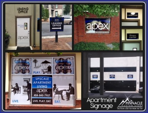
Later in the project, we did a second site visit and realized that a large section of windows that was not included in the original scope of the project had worn and faded vinyl as well. We wound up adding this to the project as well.
After installing all of the signs, the residents and guests are now able to navigate the facility with ease. Apex’s fresh contemporary look will surely attract new tenants and Venterra was very satisfied with the finished project.
As with most changes in ownership of a property, the new owners want to give it their own branding, in addition to giving it a fresh new look. A full service sign company can help give a consistent look to the entire site, even if there are several different types of signs, requiring varied materials.
New Monument Sign for Stor-Your-Stuf
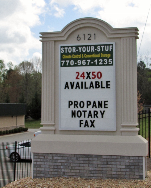
Stor-Your-Stuf contacted Pinnacle Custom Signs since they were in need of a new sign to identify their location on a busy road in Flowery Branch, GA. The county was also planning on widening the street in the very near future, so this needed to be taken into consideration for the placement of the new sign.
The old sign was a light house which included a light box to allow Stor-Your-Stuf to announce special deals to attract customers. It was not very prominent and would be easily missed if you weren’t looking for it.
The new sign is approximately 10′ tall by 8′ wide and still sports a light box with tracks so that the customer can still advertise special deal to its customers using changeable letters. This sign will now be clearly visible to passersby, especially after the road is widened.
