Contact Info
Signage Repair & Maintenance
Any sign requires a little maintenance and repair from time to time, and your sign will be no different.
Make certain your sign investment lives long and performs to its full potential by using our maintenance and repair services. We can establish a regular maintenance schedule or respond in short notice to any wear and damage you may incur.
If you are fortunate enough to enjoy your sign for a long lifespan, the time may come to give your image a facelift. Refurbishing does more than giving your signage a fresh start; it can save you a great deal of money and hassle. Refurbishing a sign is more cost effective than replacing it, and, it allows you to bypass permitting processes necessary if you order an entirely new unit.
Give us a call if your sign isn’t doing its job of attracting customers to your location. We will schedule a site analysis and provide a free estimate of what it would take to get it back on track: be it a repair, refurbishment or a complete replacement.
How to Avoid Replacing Your Business Signage
 business’s professional appearance and brand visibility." class="wp-image-9744" srcset="https://www.pinnaclecustomsigns.com/wp-content/uploads/2013/02/Single-Source-361x500-217x300.jpg 217w, https://www.pinnaclecustomsigns.com/wp-content/uploads/2013/02/Single-Source-361x500.jpg 361w" sizes="(max-width: 217px) 100vw, 217px" />
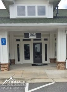
Part of maintaining a positive, public image is maintaining a clean, bright, shiny appearance of your business signs. A dull and faded sign sends a negative message about a business, and will most likely give people a poor impression of a company before they even step foot in the store. Even signs made of the finest material won’t last forever as they eventually will become dented, discolored, etc. after both time and weather have taken their toll. Don’t be that business with a sign out front that clearly looks like it is on its last leg of life.
When considering what materials to use for your business signage, longevity is sometimes more important than one with a flashy or an outstanding appearance. It is better to think about what will last the longest and serve your business best in the long run.
For example, if you choose flimsy, unreliable material which causes your sign needs to be taken down for repair and restoration, it could lead to precious time that your business is operating without an identifying sign. During this time, there is nothing to inform potential customers of who you are or where to find you.
If your signage does need to be replaced, not only would you have to pay for a whole new sign, but additional installation charges will need also need to be taken into consideration. All of this could have been potentially avoided if there had been a little more collaboration with your sign company in choosing more durable, long-lasting materials.
However, the positive aspects of getting new signage is that it gives you a chance to renew your business’ appearance with an up-to-date look. This keeps your business image fresh, while also preventing safety hazards that an unstable sign could cause.
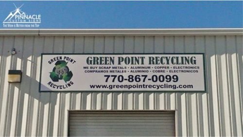
There is no definite way of telling how long a sign will last, especially outdoor signs, as it depends on the location, maintenance, and materials used. Aluminum , or a composite material such as High Density Urethane (HDU), are some of the most durable material to use, especially for outdoor signs that need to last for several years.
On the other hand, temporary signs such as banners are not made to last forever and instead should be used for a grand opening or seasonal offerings and not your on-premise signs. Keep in mind that having old signs that are falling apart reflects badly on a business by giving the impression that image is not important.
If you don’t want to replace your signage, there are alternative methods to help refurbish your signs, such as painting, to improve lifespan. Avoiding inferior materials to begin with will also save you a great deal of trouble and money in the long run.
A good sign company will care about your image and treat your brand as if it is their own. If you have signs that need a bit of a facelift, give us a call and we can walk you through your options in making that happen.
Renovating Two Pylon Signs for Berlin America
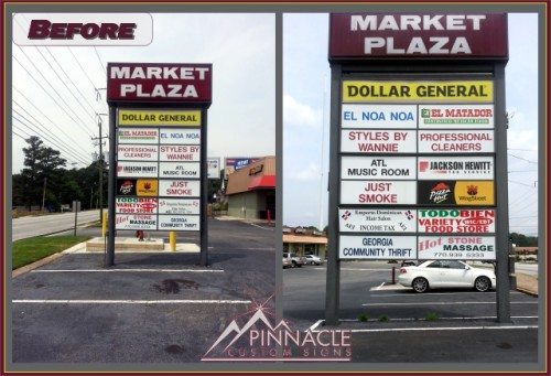
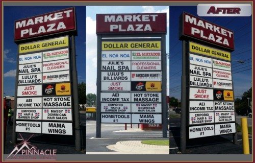
In April of this year, Greg Van Dam, a local property management liaison, asked us to go do site surveys on two pylon signs for a shopping center at the corner of Chamblee-Tucker Road and Pleasantdale Road in Doraville Georgia. The shopping center was undergoing renovations and the owner of the property, Berlin America, wanted to update their pylon signs at the same time.
A pylon sign is usually constructed of an illuminated cabinet atop a single support pole. The support pole is not covered with any kind of embellishments. They are often used at shopping centers or along highways due to their high visibility.
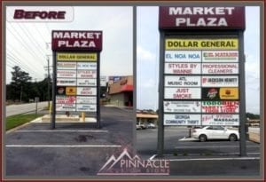
These pylon signs are used to identify the all tenants of the shopping center. The biggest challenge with the job was that the property now had more tenants than there were spaces on the existing signs. So, we brainstormed ideas with Greg to determine what would be the best way to make sure all tenants were able to be identified.
One suggestion was to take some of the tenant identifiers and reduce the sizes by half. While this would be the lowest cost option, Greg didn’t feel this would be fair to all of the tenants since not all the spaces would be impacted and it might cause concerns to those who would receive a smaller space.
Another option was to add double sided light boxes in order to add more tenant “slots” on each sign. However, the existing signs already had a topper on it that would not allow for the addition of the light boxes to the top of the sign.
The signs were originally constructed of two poles with light boxes welded to them, and, fortunately, there was enough space at the bottom of the sign to add another light box to accommodate the additional tenants, and proved to be the best solution to the challenge. Since we were installing on the bottom of an existing sign, height was not a concern.
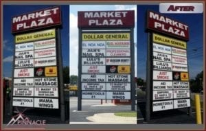
Once the decision was made, we determined all of the specs and took the appropriate measurements in order to have the light boxes fabricated for us. We were then able to get them welded in place and the electricity hooked up in a days’ time, and the customer had a great new look to the sign.
After updating the pylon signs’ structure, we next had to update the tenant signs to make them current. This meant replacing tenant names that were no longer part of the shopping center and add new tenants to the new light boxes.
In doing this, we had to re-produce 6 signs on each side of both signs for a total of 24 faces. It was also very important that the sign didn’t have a vacant look of missing sign faces for too long. We did this by removing the faces on Wednesday and had them back in place by Friday.
Refurbished Sign Faces – A Cost-Effective Solution
Changing Faces in the Sign Industry
Recently we have had the opportunity to help two customers with updating the look of some of their signage. Instead of creating brand new signs for these customers, we refurbished sign faces on existing signs, giving the appearance of new signs for a fraction of the cost of installing new ones.
Capital Markets Compliance
Rick Alvarez of Capital Markets Compliance in Norcross, GA had an existing sign in front of his building on a pylon. The sign faces had been showing signs of age, and, since they recently changed their logo, it was the perfect opportunity to change the sign faces with the updated look.
We started with a site survey. In reviewing the sign, we determined that one of the faces was reusable, but the second one had to be completely replaced.
For the replacement face, we ordered pre-cut acrylic to size from our supplier. We then applied the new graphic to the face. For their second face, we simply removed the old vinyl, cleaned up the acrylic and installed graphic.
The sign now looks almost new and with their updated logo, it has a fresh, crisp and clean look.
Providence Real Estate Consulting
Ron Morris of Providence Real Estate Consulting had just purchased a new building in Loganville, GA and was moving his team to this location. The previous location belonged to Global Christian Network television.
The new property had a good size, double-sided pan face sign that he wanted to reuse since there was nothing wrong with the sign itself. He asked us to come out, remove the faces, clean them off, replace the graphics and re-install the sign faces.
We went and removed the sign faces and transported them to our facility in order to do the update. We then took the time to carefully remove the existing graphic and replaced with a new one advertising Ron’s business.
When we were finished the sign looked new again, and it was a very cost-effective way for Ron to brand his location.
In both these projects, the customers were able to efficiently brand their businesses at a fraction of the price for brand new signs. Additionally, it was also a more “green” solution, in that it reduced waste since the existing signs were still very usable. If you are moving to a new location, or need to refurbish an existing sign, your sign company can help you to determine the best solution for renewing an existing sign and make your business stand out.
If your property has old, weathered signs that need a facelift, give us a call or click the button below for more information.
Sign Maintenance Keeps Venterra Living’s Apartments Looking Fresh
Sign maintenance is key to keeping any commercial property up-to-date. This is no different for apartment complexes, who need to maintain a polished look to attract new potential tenants. In the past few months we have had the opportunity to work on a few sign maintenance projects in Georgia for Venterra Living. While Venterra Living is headquartered in Ontario, Canada, they manage several apartment communities across the southeast. We have been working with Regional Maintenance Manager, Tosh Milligan, who has asked us to replace several signs that were in desperate need of an upgrade.
New Sign Faces for Park Manor in Newnan
Just like a subdivision sign, or a lobby sign for an office, the main entrance sign makes the first impression on potential tenants. If that sign shows signs of wear, what type of impression will that make? The entrance sign at Park Manor apartments in Newnan, Georgia, had this issue. The sign had weathered badly and they needed to change out the inserts at the bottom of the sign. We recommended using High Density Urethane (HDU) to replace the face and inserts. This is a sign material that holds up to the outside elements and creates a professional look for the sign. Once we had the sign routed, we then hand painted it with colors picked out by the marketing department. The contrasting colors used really stand out against the light-colored stone work encasing the sign. The professional look invites people to join the community.
Entrance Sign Upgrade for Legacy at River Crossing in Macon
Our next project also involved replacing the face of the entrance sign. It was for Legacy at River Crossing in Macon Georgia. However, this sign face was not inset into a brick base like at Park Manor. Rather, the face covered the entire monument face. This allowed the text to be fairly large in order to grab attention of potential clients. Again, we chose to use routed HDU to replace the face after removing the old, worn faces. The sign now has a fresh look to attract new renters.
Various Property Signs for Westminster at Buckhead
Our most recent project was for Westminster at Buckhead. This property, which is located in Buckhead, one of Atlanta’s trendier parts of town. This property did not need a new entrance sign. Rather, they needed informational signs throughout the property.
They wanted the signs to have an upscale look to them, but not the expense associated with cast iron signs, due to the amount of text needed on each of the signs. So, for these signs, we used routed HDU again, in order to give the signs some depth. But, rather than routing all the verbiage, we used inserts made of poly-metal (a.k.a. dibond) to provide the text for each sign. These signs were put up across the property, identifying the leasing office, resident parking, the information center and its hours as well as identifying the complex as private property. We continue to do several smaller upgrade project for Venterra at several of their locations across the Georgia region. As a property manager, maintaining the property is key in keeping residents happy. Sign maintenance is just as important for property management as is keeping the facilities in tip-top shape.
