Contact Info
Graphic Sign Design
A Sign with design makes a customer line!
Some signs seem to grab your attention as soon as you see it, while others are often unnoticed. What differentiates a good sign from a bad sign? Often, it goes back to how the sign is designed: the elements used in the design, the colors, the font and more.
There’s no need to bring a design with you. Just gather your ideas and let us help. Our team can assist from square one by talking through basic requirements and concepts before developing a design you like and a finished piece you’ll adore.
We can do this for the simplest of signs as well as the more complicated designs such as those used for vehicle wraps. And with a library of ideas from past jobs, as well as art and image catalogs at our disposal, we have the resources to get your project started in the right direction.
Graphic Design for Georgia State University Vending Machines
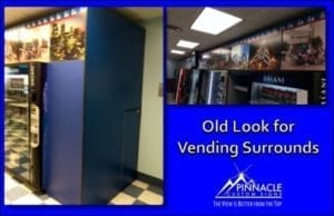 Last summer, Chris Connelly and Kevin Kelly of Georgia State University (GSU) approached us about a project to add graphics to the vending machines in four new locations on campus: Kell Hall, Langdale Hall, Library South and Auxiliary Services (which houses Panther Pizza).
The purpose of the vending machine surrounds was to enclose the machines into a confined area which minimized gaps between the machines as well as hide any electrical cords and plugs. It also provides an area for additional branding, showing some examples of athletics and student life.
When the team went out to visit the university to see an existing vending machine surround, the existing one was a wooden structure built around the machines and covered with graphics.
The example surround was basically a façade that sat on top of the vending machines and had graphics across the entire face.
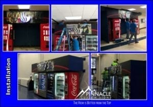
The initial thought was to mimic the existing structure for the four new areas. However, after seeing what the university was trying to accomplish, the team proposed building the structures out of aluminum instead of wood.
The aluminum structures would be more durable than the wooden structures and would have cleaner lines. Additionally, they would not be as heavy as the wooden ones, another benefit.
With this new design, we added reverse-lit channel letters in the shape of the Georgia State Logo and a panther head to go on the one in Panther Pizza. This added some pop and would bring attention to the vending areas along with the graphics featuring campus life.
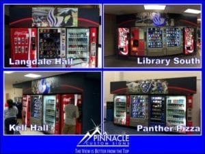
As the school’s winter break approached, so did the installation job. The spaces that some of the surrounds were going into provided some tight installation challenges.
Because the vending machines were not moved out of the way to do the installation, some of the guys wound up climbing on top of the machines in order to secure the surrounds in place. All in all, it took our entire production team two days to complete the job.
The new look for the vending machine surrounds opens up the opportunity to do all them across the entire campus, giving all vending areas a consistent look, including those that the university acquires in the future.
Getting the Right Vehicle Graphics for Your Business
Recently we have had the opportunity to work with three separate companies on branding their vehicles to advertise their business with graphics that would highlight who they were and how to get in touch with them.
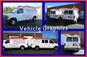
The first company we worked with was Murray Electric, owned by Erik Murray. Eric had been in business for a few years, but had just gotten a second van and thought it was time to properly brand both. He wanted to highlight his services and contact information at a cost-effective rate.
We worked with Erick on coming up with a design that was clear and concise, leaving no doubt to potential customers what their services included and how they can reach them.
To make the design cost-effective for a small business owner, we opted to use cut vinyl lettering that stood out against the white background of the vans themselves. His two vans are now mirror images of each other and are rolling advertising for him.
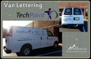
Shortly after this project was completed, we began working with Michael Bailey and Todd Fink of TechPoint. They approached us about putting graphics on their service vans and wanted not only to highlight services, but also to showcase their logo.
We started with one van, but the goal was to create a look that can be transferred to their other vehicles, in addition to creating a standard for all their vans.
They came into our facility and sat down with us to develop the look and feel they wanted, and we utilized printed and cut vinyl as well. The look is clean and highlights who they are.
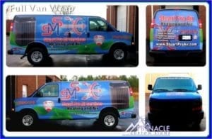
Finally, we also had the opportunity to fully wrap another service van for Stuart Mechanical, here in Buford. Earlier last year we created a design that we installed on two vehicles. We were able to take the design and apply it to their new service van, continuing the branding that we had started in 2013.
As you can see, each company had a specific budget and need for advertising their business. Vehicle graphics have a wide range of options from simple cut vinyl lettering such as what we did with Murray Electric, to the full vehicle wrap which covers the entire surface of the vehicle.
And, since there are so many options, there is a wide range of costs, from as low as $400 to upwards of $3,500, depending on the size and shape of the vehicle, the type of vinyl as well as many other factors.

