Contact Info
Wayfinding & Compliance Signage
Have you ever wandered into a business for a meeting and had trouble finding which room you were supposed to be in? Take that feeling you had and multiply it by 1,000 and you’ll get a glimpse of what someone with a disability would feel in a similar situation.
Visual signs work well for people that can see, but the signage for your business must also be able to effectively communicate to individuals who are sight impaired.
Why does your signage need to be ADA compliant?
ADA stands for the Americans with Disabilities Act. The ADA was first adopted in 1990 to ensure that people with disabilities had equal opportunities in public areas such as in government services, employment, and commercial facilities, to name a few.
In 2010, the final regulations were published which included the adoption of updated ADA Standards for Accessible Design. These are the design standards that must be followed for all facilities to ensure that people with disabilities, such visual impairments, are able to get around these facilities as well as those without these disabilities.
When you order your signs from Pinnacle Custom Signs, we can create attractive business sign designs that will fit in with your organization’s décor, yet meet the ADA sign requirements as well. Perfect for offices, schools, and even churches, customized interior signs made by a certified producer can help you look good and be compliant too!
Which wayfinding signs need to be compliant?
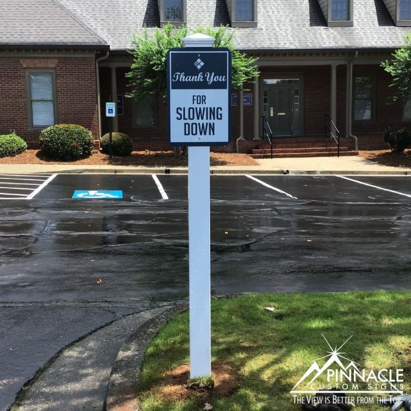
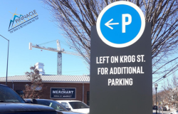
Not all signs need to follow the ADA Design Guidelines. Building Addresses, Directories, Parking Signs and Temporary Signs are all examples of signs that are not required to be ADA compliant. However, all rooms, whether they have numbers or names, are required to follow the appropriate guidelines set forth by the ADA.
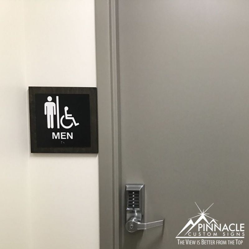
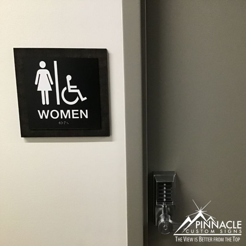
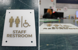
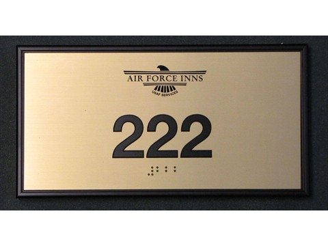
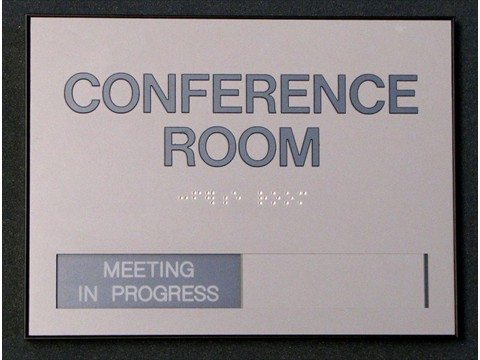
Rooms or areas that are not likely to change functions over time, should be identified by a name, rather than a number. This would be appropriate for rooms like restrooms, kitchens, elevators, etc. These types of rooms are REQUIRED to have ADA Compliant compliant signs identifying them.
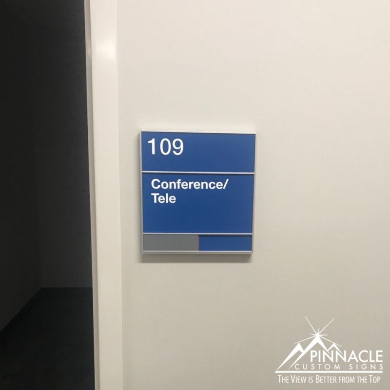
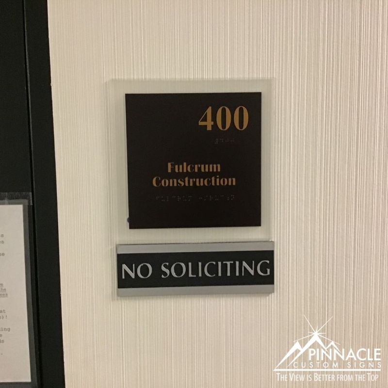
Other rooms, like classrooms or people’s offices, are more than likely to change over time. For this reason, room identifiers for these types of rooms usually have a number to identify the location of the room/office. Often, these will also have some other way to give more information about the room using things like paper inserts to further identify what or who is in the room. While these rooms are not required to have ADA compliant signs, it is a still a good idea for them to follow ADA guidelines, making the rooms accessible to everyone.
With our custom interior signage designed based on your branding and needs, we can combine your wants with the ADA requirements to create the perfect signs for your business.
The more times someone sees your brand, the better they’ll be able to remember who you are and what you do. Custom interior signs with ADA compliant specifications can include your brand on each sign, yet still meet government ADA regulations. This ensures that people will always be able to your public places and facilities and limit any liability you may have without these signs present.
If your business needs new ADA or handicap signs or just a new look, let us know. At Pinnacle Custom Signs, we can create the perfect sign for you today!

What makes ADA signs different?
ADA Signs have several features in common, and each of these features have rules that must be followed in order to make them more visible. Let’s look at some of these in a bit more detail:
Finishing & Contrast
ADA Signs are required to have a matte, i.e. non-glossy, finish. This is to keep reflections to a minimum, making the information on the signs easier to see and read. Additionally, there needs to be a considerable contrast in colors between the background of the sign and the characters on the front of it. It doesn’t matter if the background is dark and the characters are light-colored or vice versa. You just need to make sure that there is enough contrast between the two to make the message on the sign clearly visible.
Fonts
While most people focus on fonts for the aesthetic viewpoint, for ADA signs, there are specific rules that must be followed. First, the font should be a sans serif font such as Arial Medium, Helvetica, and Myriad Pro. These fonts are similar to the ones shown on this slide. Serif fonts are those like Times New Roman and Garamond. Additionally, certain characteristics of the font must also be adhered to on these types of signs. Things such as too much or too little spacing between the letters make the text more difficult for reading. Condensing or extending the text on an ADA sign can make it non-compliant to standards. Text that is part of a an ADA sign (such as the room number or name) is always raised, making the letters tactile so that they can be determined by both site and touch. Finally, italics, script or decorative fonts are not allowed since they often make it difficult to read clearly. Again, the goal is to make the sign as legible as possible.
Pictograms & Symbols
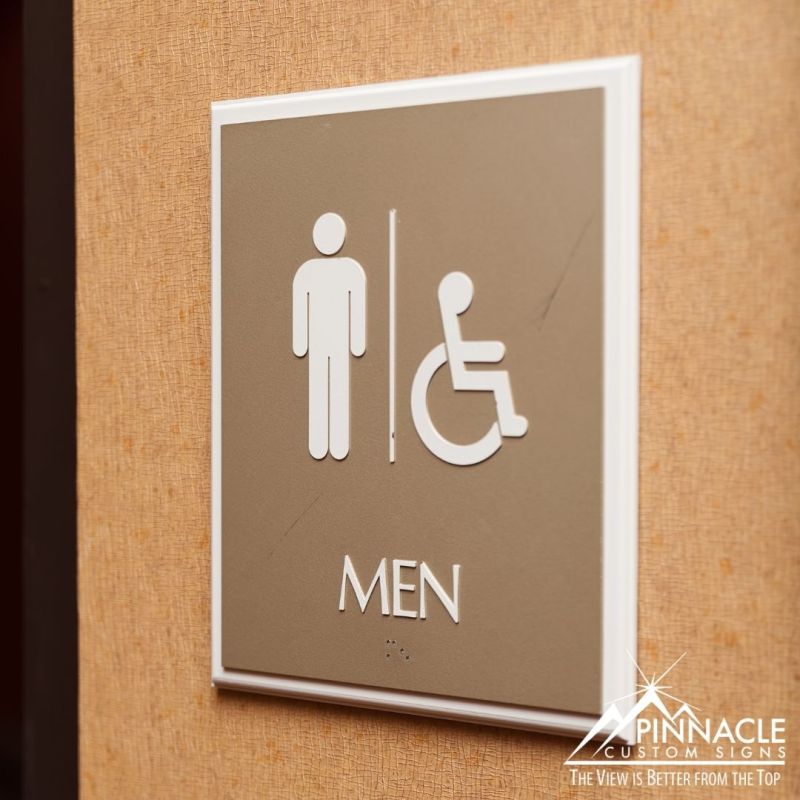
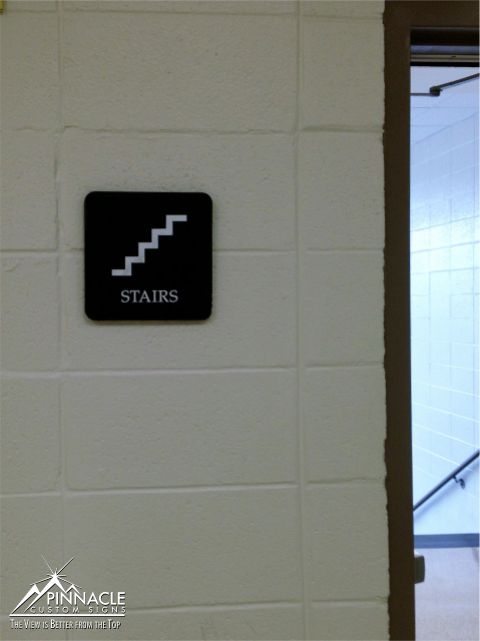
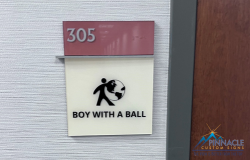
Almost everyone knows many of the standard pictograms that are placed on ADA signs – you have the man and women and wheelchair that are most often seen on restroom signs, the cigarette with a circle and line through it to denote No Smoking, staircases, etc. Certain pictograms are required – these are usually indicate something to aid a handicapped person, such as a wheelchair sign or one that indicates a phone for the hearing impaired. Other pictograms, while not required are recommended. Some of these (as well as those that are required) also require that the sign is at least 6” tall.
Braille
Braille is one of the easiest ways to identify an ADA compliant sign. In order for a sign to be ADA approved, it must use what is called Grade II Braille, which is contracted or abbreviated braille. Braille must also be dome shaped and precisely sized and spaced, and be placed ⅜” to ½” below the last row of raised (or tactile) text. Braille is also in all lower case letters, unless it is for proper names, acronyms and letters that are part of a number (like in room 81B – the “B” will be in upper case).
Installation & Mounting Requirements
ADA Guidelines also regulate how these signs are to be installed within a building. Room signs are to be mounted on the latch side of a door and are to have the tactile letters a minimum of 48” from the floor to the baseline and a maximum of 60” above the floor. Ceiling or wall projection signs must have a clearance of 80” from the floor to the bottom of the sign.
Local Codes & Requirements May Differ
We’ve just gone through the basics of the guidelines here. It is important that you know what is required for your building – what informational signs are needed, whether or not they require tactile lettering & Braille, etc. Often these can vary state by state and building by building, depending on the nature of the work being done there. Since enforcement to these codes is handled by local code inspectors, be sure to find out what might be required for your location.
At Pinnacle Custom Signs, we can design signs for businesses that allow you to properly label each permanent room you may have that someone with a disability may need to access.
Just because you make your signage ADA compliant doesn’t mean you need to sacrifice your branding or color scheme to do it. Contact us today to start a conversation about how we could help improve your ADA signage at fair and competitive rates!
ADA Signs With Style
Although ADA Signs must follow the rules we just went through, it doesn’t mean that they have to be boring, institutional signs. There is plenty of room within the existing guidelines to allow for creativity in producing these signs.
There are many different types of substrates that are used in creating ADA signs such as plastics, PVC, acrylic and various metals. Often there can be a combination of these materials put together to create signs that enhance any office decor.
Signs can be mounted directly to the walls and doors (following the proper height and placement guidelines) using very high-bond double-stick tape, or they can employ standoffs to add a dimensional aspect as well as a to the signs. Another option is that if the sign face is thick enough, to employ “stud mounting” which uses metal studs that go into the back of the sign and into the wall, using silicone to keep it in place.
Recently, the trend is to mix the media types used in making these signs such as a combination of metal, plastics, and vinyl. And, with the tools available to create them, combinations are endless. At Pinnacle, we can create ADA signs using either rotary or laser engraving, which allows for unique combinations.
Don’t forget that you aren’t limited by the colors of your ADA signs, so you can use colors and textures that match your decor or your brand standards, as long as the combination of background and lettering offer enough of a contrast to help a visually impaired person be able to read the sign.
The key to remember here is that as long as the finishes, contrasts, and spacing follow the guidelines, then your sign will be compliant.
At Pinnacle Custom Signs, we can not only create a customized sign with your branding on it that meets today’s ADA requirements, but we can do it at a fair and highly competitive price.
In this video, Theresa Conklin talks about ADA & Handicapped Signage and why you need them. You can also view the video on YouTube here or view the slide deck here: ADA & Handicapped Signage
Related Projects
2014 – Changeable ADA Signs For Georgia State University
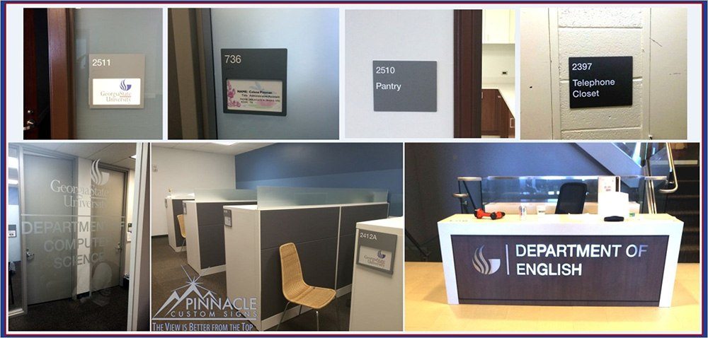
Georgia State University, located in the heart of downtown Atlanta, GA, contracted us to produce new ADA compliant room signage as well as signs to identify key department locations. We reviewed the floor plan and list of requirements from GSU’s construction department and identified and we determined the best types of signs needed to meet the requirements.
For new classrooms and faculty offices, we produced a standard 8″ by 8″ room sign with raised lettering and a clear window pocket that allows for a paper to be inserted with the current room assignment information. The room numbers were raised lettering with braille below, per ADA standards.
For more permanent functioning rooms, ie. conference rooms, electrical rooms, bathrooms, etc., we created similar signs. These signs were 8″ by 10″ without a clear window. The room identifying text used tactile letters with braille below.
We also installed office signs for four department locations, using dimensional lettering in some locations, and frosted vinyl lettering on glass for other locations, depending on the location’s set up.
Since 2014, we have continued to work with GSU on other signage projects as needed.
2013 – ADA Signage Projects for Atlanta Public Schools
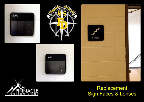
In July 2013, Atlanta Public Schools contacted us concerning a sign project for Frederick Douglas High School. The project involved identifying and replacing or repairing ADA signs throughout the high school. Many of the room signs identified the room with a room number and included a clear window that allows for a paper insert that could be changed as the room designation changed. Other ADA signs were also in need of repair or replacement.
After doing a walk-through of the building and identifying the signs in need of replacement or repair, we submitted a bid and were given the contract. The major challenge for the project was the timeline. They needed the signs up before school started back up, which was within 10 days. The materials we needed to do the job were on back order, and there were 100s of signs needed.
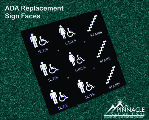
We devised a plan to help them meet their goals while still providing them with a high-quality product. To get the school year started, we created temporary replacement signs using cut vinyl and PVC. Once the proper materials arrived, we manufactured, assembled and installed over 100 signs at the school. By the end of the August, the high school was fully outfitted with new signage.
We were able to complete this project because of our ingenious and hardworking staff and because we had the equipment to do it in-house. If you are in need of help, please don’t hesitate to contact us. The sooner we can start planning the quicker we can create a signage strategy that works for you.
